Thursday, 29 January 2015

The Graphic Design Time-line

The Graphic Design Timeline:

Graphic Design as we know it started out in the very beginning of time since the Stone Age when the cave-man drew pictures of them hunting animals etc but as humanity went along it took records of the ages and time and records of what happened. This is the time-line of Graphic Designer:
1465 - Gutenburg
1480 - Intaglio Printing
1750 – The Gothic revival
1798 - Stone Lithography
1814 - Grotesk typeface
1818 – Photo-engraving
1837 – Queen Victoria’s reign (Victorian Era)
1846- Rotary press
1850 – The Arts and Crafts Movement
1885 - The half tone process
1886 - The linotype
1890 - Art Nouveau
1908- The offset lithography
1917-  De stijl / Constructivism
1919 - Bauhaus
1925 - Art Deco
1930 – Swiss Style
1940 – The New York School Movement
            -Paul Rand (designer)
1950 - Saul Bass
1957 - Helvetica
1960 - Pop design — Milton Glaser / photo type setting
1970 - Psychedelia  / Digital type / Punk (Jamie Reid)
1984- The birth of the Macintosh
Artists - Wolfgang  Weinhart
               David Carson
               Stefan Sagmeister
                Paula Scher


This information was given to us by our lecturer during one of her lessons. 

David Carson

            David Carson is an American graphic designer, an art director and also a surfer. He is famous for his innovative designs of magazines and his use when it came to deal with experimental typography. He was also an art director of a famous magazine called Ray Gun in which he implemented much of his typographical and layout styles for which he is known most for. He was also the founder of the ‘grunge-typography’ era.

            He was born on the 8th of September of 1954 in the area of Corpus Christi in Texas. In his early years he attend the San Diego State University and graduated with a Bachelors in Sociology. The first time Carson came contact with graphic design was during a  two weeks graphic design course at the University of Arizona in 1980. From 1982 – 1987, Carson worked as a lecturer at a highschool which goes by the name of Torrey Pines High School in San Diego. While he was teaching there he was enjoying his life as a professional surfer and during 1989 he got the ranking of 9th best surfer in the world.

          During 1983, Carson started his experimentation with the graphic design and he quickly plummeted into the world of the artistic and relaxed culture of Southern California. That same year he went abroad to Switzerland and attended a three-week long workshop which was part of his degree in graphic design. The workshop was being taught by Hans Rudolf Lutz thus Carson used him as his first great influence.

        After some time Carson became an art director of a magazine called Transworld Skateboarding and held his position with the magazine up till 1988 to help the magazine get a distinctive look and get more appealing to people. While he was working there he developed his style by using the ‘dirty’ type and photographic techniques which were against the norm. He also collaborated on another version of their magazine called ‘Transworld Snowboarding’.

AIGA | the professional association for design, (2015). David Carson. [online] Available at: http://www.aiga.org/medalist-david-carson/ [Accessed 29 Jan. 2015].

Flask, D. (2015). David Carson : Design Is History. [online] Designishistory.com. Available at: http://www.designishistory.com/1980/david-carson/ [Accessed 29 Jan. 2015].

New York School Movement- Saul Bass

Saul Bass:

He was an American Graphic designer and was also an Academy Award winning film-maker which was widely known for his design of movie title sequences, movie posters and corporate logos.
During his 40 year old career, Bass worked for a lot of prominent film-makers. The list of film-makers varies from Alfred Hitchcock, Otto Preminger, Stanley Kubrick and Martin Scorcese. Among his famous title sequences there is the famous one known as Preminger’s the ‘Man with the Golden Arm’ which is about a heroin addicted jazz player.
Saul Bass also designed some of the most famous corporate logos in the North American TV including the Bell System logo during somewhere in 1969 and also the AT and T’s globe logo during 1983 after there was some chaos of the Bell System. He was also responsible for the logo of the Continental Airline and became one of the most  famous airline industry logos.

Bass’s philpsophy of his title sequences was to ‘’try to reach for a simple, visual phrase that tells you what the picture is all about and evokes the essence of the story”. Another philosopy he used to describe the thought about his title sequences was that the audience can see familiar parts of their world in a very strange and unfamiliar manner. A few examples of that theory are the sequences “Walk on the Wild Side” which describes a cat that in the sequence he becomes a predator. He had been designing title movie sequences for over 40 years and while doing it he used and implemented a lot of interesting techniques which ranged from cut-out animation which is seen in “Anatomy of a Murder” to fully animated short movies like the epilogue for the movie Around the World in 80 Days. There were also live action sequences which their purpose was mainly to be used for title sequences that contained prologues to their respective film and transitioned in their opening scenes.
When his career seemed to be reaching an end he was once more discovered by James L. Brooks and Martin Scorcese whou both of them grew up admiring his works done with the opening sequences. He created the titles sequences of Goodfellas, Cape Fear and Casino in collaboration with Scorcese and his second wife Elaine Makatura.

Socialpsychol.wordpress.com, (2015). Anatomy of a Murder | socialpsychol. [online] Available at: https://socialpsychol.wordpress.com/tag/anatomy-of-a-murder/ [Accessed 29 Jan. 2015].


Saulbass.org, (2015). Saul Bass. [online] Available at: http://saulbass.org/index.html#about [Accessed 29 Jan. 2015].

Psychedelia

Psychedelia:


           The psychedelic movement started in the mid 1960’s effected a lot of things such as music but its effects also lingered on many characteristics of popular culture. This included fashion in which meant the style of what kind of clothes were being worn at that time, the language and how people communicated with each other and the way how people spoke about the arts, literature and philosophy.
         The term “psychedelic” refers to the effects that drugs leave on the individual. During that period drugs were very popular within the youths. The posters which were designed for rock concerts a lot of effort was put in to try to express visually the drug-like feeling of tripping out.

          The visuals of the psychedelic art include inspirations from the much earlier movements and their characteristics such as the Art Nouveau-inspired whiplash shapes, and “un-able to read” hand-drawn typography, and the intense optical colorful vibrations which were heavily inspired by the Pop Art movement.

           The end of World War II in 1945 brought with it a post-war economic boost in the United States of America. It also brought a fluctuation in the birth rate which is famously known as “the baby boom.” It is known that between 1945 and 1957 about 76 million babies were born in America and by the middle of 1960s, most of these kids were the young adults of that generation.
            As young people usually do, these “baby boomers” started questioning America’s greediness and the conservative cultural and political social norms. Following these events a youth movement emerged, which sought to create an free society which was free from discrimination. The Feminists and the Black movement are the off-spring of this revolution.
           The Americans in the 1960s and 70s started to address a lot of controversial issues which ranged from civil rights, the Vietnam War, nuclear explosions and the environment to have free drug use, sexual freedom and being original. Many youth sought spiritual beliefs through Eastern Mysticism and the usage of drugs that induced psychedelia. 


            There was also a rise in music festivals and concerts and they were a very prominent feature of the 60s eralandscape, and there were a lot musicians that were in vogue such as Jimi Hendrix, The Who, The Grateful Dead and Janice Joplin who were the super-stars of those times. It is very hard to say whether the psychedelic music influenced the culture itself or vice versa. It was a unique artform that found its expression in prominent band posters.

Graphic Design History, (2011). Psychedelic 60s. [online] Available at: https://visualartsdepartment.wordpress.com/psychedelic-60s/ [Accessed 29 Jan. 2015].
Gds.parkland.edu, (2015). Graphic Design History | Psychedelia. [online] Available at: http://gds.parkland.edu/gds/!lectures/history/1960/psychedelia.html [Accessed 29 Jan. 2015].

Stefan Sagmeister

Stefan Sagmeister 

The famous graphic designer Stefan Sagmeister (August 6, 1962) is designer which is based in New York. He is also a lettering artist which means he incorporates the manipulation of letters with his works. He is also the co-founder of a design company called Sagmeister and Walsh alongside his colleague Jessica Walsh which is based in New York City. His works included album covers for famous musicians such as the Rolling Stones and Aerosmith.
Sagmeister started his graphic design career at the University of Applied Arts in Vienna. After some time he received a Fulbright scholarship from the Pratt Institute in New York. His career of an actual graphic designer started when he was at the age of 15 with “Alphorn” which was an Austrian magazine for youths. The magazine was named after a traditional musical instrument which was used by people in the Alpine regions.
During 1991, his journey in graphic design took him to Hong Kong  to work with an individual which goes by the name of Leo Burnett to work with Hong Kong Design Group, two years later in 1993 he went back to the city of New York to collaborate with Tibor Kalman’s M and Co design company although his stay in there was short lived because after a while Kalman decided to retire from the design business and went to work for the Colors magazine which was part of the Benetton Group which was situated in Treviso in Italy.


After that happened, Sagmeister made the proceedings to form his New York based company named Sagmeister Inc which specializes in branding, packaging and graphics for a lot of diverse clients like bands such as the Rolling Stones, broadcasting services such as HBO and telecommunication companies such as Time Warner.  
Sagmeister is very well known to have collaborated with a lot of famous people such as the musicians David Byrne and Lou Reed.


Show, S. (2015). About Stefan Sagmeister. [online] Stefan Sagmeister: The Happy Show. Available at: http://thehappyshow.tumblr.com/Bio [Accessed 29 Jan. 2015].


Flask, D. (2015). Sagmeister : Design Is History. [online] Designishistory.com. Available at: http://www.designishistory.com/2000/sagmeister/ [Accessed 29 Jan. 2015].

Wednesday, 28 January 2015

Swiss Style

The International Typographic Style/ Swiss Style

The International Typographic Style, which is also known as the Swiss Style is a form of graphic design style which originated from Switzerland during the 1950’s. It’s characteristics emphasized neatness, very accurate readability and a sense of independence. One particular characteristic was that the style contained asymmetrical layouts, the usage of the grid system and a sans-serif typeface like the famous “Akzidenz Grotesk”.  This style is also known to have a particular preference for photographs to be used instead of illustration and drawings.

There were two major Swiss design institutions which are responsible for the birth of the Swiss Style. The inspiration of this style came from the earliest form of a graphic design technique which was built on grid-work that started sometime in the 19th century. It was starting to be used to change how some of the courses viewed their foundations at the School of Design. After a while during 1918 Ernst Keller started his career as a professor at the Zurich School of Applied Arts which is also known as Kunstgewerbeschule. He started to develop a course related both to graphic design and also typography.

As a teacher, he did not teach and educate his students with a specific style but rather taught a philosophy that said “the solution to the design problem should emerge from its content.” Keller’s works used a combination of simple geometrical forms, bright colors and images that shocked the individual to enhance the meaning behind each and every one of his designs. Several important people that gave contributions to the style were Theo Ballmer and Max Bill.
During the 1950’s the style started to evolve and some of its elements started to be included in other types such as the “Univers”. The “Univers” paved way for a certain individual known as Max Miedinger and his collaborator Edouard Hoffman created the font known as “Neue Haas Grotesk” which is most commonly known as the “Helvetica”. In 1959 there was a publication called the “New Graphic Design” which was edited and run by a lot of influential graphic designers who played major roles when it came to the development of the Swiss Style. The format of this journal was designed to have a lot of the style’s characteristics such as to be effective to when it came to visually demonstrate the content that was present and it was being published internationally which further lead to the flow of the movement.

After the events of World War 2 there was a sudden boom to when it came to international trading and good relationships between a lot of countries were starting to get better and stronger. The Swiss Style facilitated the process because there was a certain clarity in it that made the style an effective way of communicating.
The style quickly spread throughout America and one of the first graphic designers that integrated the style with his own works was Rudolph de Harak. He shown the influence of this style on a lot of his works such as the book jacket designs for McGraw-Hill which was basically a jacket with a book title on it and his author.

Flask, D. (2015). Swiss Design : Design Is History. [online] Designishistory.com. Available at: http://www.designishistory.com/home/swiss/ [Accessed 28 Jan. 2015].


Terror, D. (2009). Lessons From Swiss Style Graphic Design - Smashing Magazine. [online] Smashing Magazine. Available at: http://www.smashingmagazine.com/2009/07/17/lessons-from-swiss-style-graphic-design/ [Accessed 28 Jan. 2015].

Dada

Dadaism:


The Dada art movement started out as a reaction against the whole world due to its war-like atmosphere that was present during the origins of this movement. The Dada was ironically an anti-art movement because it embodied both a strong negative and a very destructive element. Artists and writers started to use the shock and protest elements combined with nonsense to strongly emphasize the rebellion against the horrors of World War 1.  They rejected everything that was traditional and sought to achieve a sort of freedom when it came to the arts.
The Dada was started by the poet known as Hugo Ball who opened the place called Cabaret Voltaire which was situated in Zurich for painters, poets and musicians. Ball alongside a young poet from Romania; Tristan Tzara,  Hans Arp and Richard Huelsenbeck started exploring how to create literature with nonsense in it. Tzara contributed a lot in this movement because of the rate he was publishing the Dada manifestos in which they created the perfect definition of the word chaos. The Dada art was characterized by its intention of causing emotional reactions which typically were in the form of either outrage or shock, its art contained a lot of abstractions and Expressionism (these two were its main influences) which was followed by Cubism and on a minor scale, Futurism gave its contribution as well.
Like the element of which this movement was built on: chaos, the movement spread throughout the world at an incredible fast pace thus there was a range of art in which they were either ‘pointless’ and just random works to actual meaningful visual arts which greatly influenced graphic design. Two artists of the Dada movement Raoul Hausmann and Hannah Hoch invented the technique called photomontage which basically is the manipulation of photographs to create juxtapositions in the imagery.

Kurt Schwitters:

An important figure of the Dada was the Germanic artist, Kurt Schwitters (1887-1948) created a magazine called “Merz”which was pin-pointed from the phrase ‘kommerz’ (commerce). His ‘Merz’ compositions contained a lot of photographs and recycled images and found materials to create a lot of different elements by combining color against another color and different  forms and textures with each other. His designs were very complex and they matched the “nonsense” part of Dada very well. Although he tried to join the Dadaists because he was "an artist who nails his pictures together," his appeal to enroll as one of them was refused because they said that he was too conservative.
He also wrote and designed poetry that combined sense with nonsense. He added Constructivism as an influence in his works after he contacted Theo van Doesburg whom in return invited Schwitters to Holland to promote the Dada.  Later on they worked on a book design that involved typographic forms to be used as the characters. Schwitters throughout his career published 24 issues and the 11th one was particularly focused on advertising.


Flask, D. (2015). Dada : Design Is History. [online] Designishistory.com. Available at: http://www.designishistory.com/1850/dada/ [Accessed 28 Jan. 2015].


Guity-novin.blogspot.com, (2015). A History of Graphic Design: Chapter 45; Dadaism; The meeting point of all contradictions. [online] Available at: http://guity-novin.blogspot.com/2011/08/chapter-44-dadaism-meeting-point-of-all.html [Accessed 28 Jan. 2015].

How Art Nouveau influenced the Digital Arts

How Art Nouveau lived on in the Digital Arts:

It’s been decades since the Art Nouveau Style started and vanished after the 1910’s. Although it’s importance in the applied arts and in the architecture itself remained and quite lively I might say. The style affected graphic design so much it has the right to say that it was a major influence to both the history and styles of art.
The most people that were influenced by this art style were illustrators, artists and the printing trade especially in America. During the post-war 60’s hippie movement there was a revival for the Art Nouveau Movement. Nowadays the effects and best features of Art Nouveau can be seen throughout all of the visual communication industry such as the famous painting of Marilyn Munroe  called “Visages de Renom” which was made by a New York based illustrator Les Katz. Another artist that made works of the same technique was Milton Glaser.

20 years later, the Art Nouveau has been re-evaluated because of the sudden rise of Post-Modern Design. Artist from all the corners of the around the world are making use and being inspired from the characteristics of the style such as the floral elements, the natural features and the charismatic colours and  they are incorporating them within their works.

This style can be still found in today’s fanciest homes, including both the architecture and the furniture itself. The designs of homes which have Art Nouveau decorations in them are pin-pointed by the various prints and decorative shapes which are used in the decoration of walls or in the tapestry itself. They are also used in the textiles and artistic artefacts found in these homes. 

This style also affected the digital arts and everything that is related. There is a site called deviantart where people from around the world submit both traditional works and digital art.  There artists who in both traditional and digital art have incorporated the Art Nouveau influences with modern day themes such as fan-art, original works etc.  I selected these two works because aesthetically they are exceptionally wonderful and the influences are quite visible in there such as the whiplash curves and the colouring style of the Art Nouveau.


Bigman, A. (2012). Good call, Bon Iver: Art Nouveau design inspiration - Designer Blog. [online] The Creative Edge. Available at: http://99designs.com/designer-blog/2012/09/19/good-call-bon-iver-art-nouveau-design-inspiration/ [Accessed 28 Jan. 2015].


 Pixel77, (2010). The Influence of Art History on Modern Design - Art Nouveau - Pixel77. [online] Available at: http://www.pixel77.com/the-influence-of-art-history-on-modern-design-art-nouveau/ [Accessed 28 Jan. 2015].

Wednesday, 21 January 2015

New York School Movement - Paul Rand

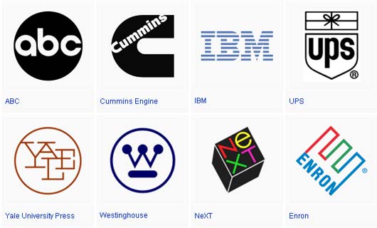
Paul Rand (August 15, 1914 – November 26, 1996) is a very famous American graphic designer, which is best known for his contribution to make corporate logo designs. Paul Rand was taught at several schools and institutions such as the Pratt Institute, the Parsons School of Design and the Art Students League. He was one of the first minds behind the graphic design movement called the Swiss Style. From the periods of 1956-1969 and the beginning of 1974, Paul Rand was a teacher and taught design at the University of Yale in New Haven, Connecticut. Rand was welcomed into a group of designers called the “New York Art Directors Club Hall of Fame” in 1972. He designed a lot of posters and corporate identities, including logos for a lot of prominent companies such as IBM, UPS and ABC. Rand passed away during 1996.

Paul Rand (also known as Peretz Rosenbaum) was born in Brooklyn, New York in the 1914’s. Since Rand was an Orthodox, the Orthodox Jewish law dictates the forbiddance of the creation of images that can be easily “worshiped” as idols; Rand’s career in creating icons was highly valued and regarded very highly in the shrine of global capitalism. It was a career that he started to embrace at a very young age; he started out by doing painting of signs for his father’s grocery store and for school events at P.S. 109. His father did not believe that art could provide his son a sufficient livelihood, and so he convinced Paul to attend Manhattan’s Harren High School and take night classes at the Pratt Institute, though none of these institutions offered Rand any stimulation to his creativity. Despite his studies at Pratt and other institutions in the New York area which included the Parsons School of Design and the Art Students League, Rand was self-taught as a designer and used the works of Cassandre and Moholy-Nagy from a lot of European magazines such as the magazine called Gebrauchsgraphik as a source of inspiration for his works.

His graphic design career started with some humble assignments, such as a part-time position that involved the creation of stock images for an organization that supplied graphics to some various companies which they create newspapers and magazines. Between his school assignments and his work, Rand was also able to collect a huge portfolio, which was mainly influenced by the German advertising style Sachplakat (decorative poster) as well as the works of the artist Gustav Jensen. It was at around this time that he decided to camouflage (and reduce) his Jewish identity which was known as ‘Peretz Rosenbaum,’ and changed his name to ‘Paul’ and took the surname ‘Rand’ from an uncle to form his new surname.  Morris Wyszogrod who was a friend and assistant of Rand, said that “he figured that ‘Paul Rand,’ four letters here, four letters there, would create a nice symbol. So he became Paul Rand.” Peter Behrens also noted the importance of this new title and said: “Rand’s new persona, which served as the brand name for his many accomplishments, was the first corporate identity he created, and it may also eventually prove to be the most enduring.” Rand was moving very rapidly towards the forefront of his profession.

Design.uh.edu, (2015). Paul Rand. [online] Available at: http://design.uh.edu/~sechung/rand3/biography.html [Accessed 21 Jan. 2015]. 


Schneider, S. (2011). Paul Rand Will Change Your Life!. [online] noupe. Available at: http://www.noupe.com/inspiration/showcases/paul-rand-will-change-your-life.html [Accessed 21 Jan. 2015].


beiki, k. (2012). A Cup Of ART : Paul Rand. [online] Kamilgraphic.net. Available at: http://www.kamilgraphic.net/2012/12/paul-rand.html [Accessed 21 Jan. 2015].

Friday, 26 December 2014

Art Deco

Art Deco 

              As exemplified by the geometric shapes and designs of various famous buildings in New York like the Chrysler Building and the Rockefeller Centre, the Art Deco Movement was one of the most fashionable and international design movements in modern art starting from the 1925’s till the          1940s.
            Much like the earlier Arts and Crafts Movement and as the curvilinear and organic style of design known as the Art Nouveau accompanied by the German movement known as the Bauhaus design school concept, Art Deco sought to embrace all types of the arts, including crafts as well as fine arts. It was being applied to a lot of the decorative arts such as interior design, furniture, jewellery, textiles, fashion and industrial design; it was even being applied to the art of architecture and in painting and graphics.
            Art Deco was influenced by a lot of the major art styles that occurred during the early 20th century. These influences contain a lot of the geometric forms which are also found in the Cubism, the machine-like- forms of the Constructivism and the Futurism movements and the unifying approaches of the Art Nouveau movement. Its highly intensive colours may have been inspired from the Parisian Fauvism. Art Deco also borrowed some of its designs from the Aztec and Egyptian art and as well from the Classical Antiquity. Unlike its predecessor movement Art Nouveau, however, the meaning of Art Deco was purely decorative and aesthetically pleasing.
              The Art Deco movement which was adopted by architects and designers all around the globe which gave life to a series of “events” such as the "Roaring Twenties",  the Great Depression which occurred in the early 1930’s, and the years which lead up to World War II. It suffered a great blow in its fame during the period of the late 1930’s and early 1940’s when the movement  was starting to be seen as too extravagant and showy for its surroundings which contained a war-like atmosphere. After that it quickly fell out of fashion. Later on there was a revival of the interest in Art Deco which occurred during the 1960s which coincidently occured with the movement's effect on a more recent art movement called Pop Art  and later on in the 1980s which was in line with the growing interest in graphic design.

Bigman, A. (2012). Art Deco: A strong, striking style for graphic design - Designer Blog. [online] The Creative Edge. Available at: http://99designs.com/designer-blog/2012/06/05/art-deco-a-strong-striking-style-for-graphic-design/ [Accessed 23 Dec. 2014].

Visual-arts-cork.com, (2014). Art Deco Design Style: Origins, History, Characteristics. [online] Available at: http://www.visual-arts-cork.com/history-of-art/art-deco.htm [Accessed 23 Dec. 2014].

Modernism

Modernism

            Together with the great advances of technology, the Modernism movement started to breakthrough during the 19th Century and in to the 20th. The Western society began to find new ways of how to improve the environment and its constructions and to shape the human culture. Modernism is also considered one of the “abstract movements” in graphic design because it was mainly influenced by some of the fine-art movements such as Cubism and Fauvism and even by other movements such as the Dada and the Bauhaus.
          The Modernism movement influenced and was influence a lot by the creative disciplines such as the arts, architecture, music and even literature. It was the time that machines were in vogue and the artists of that time had to learn to adapt with their surroundings and with the technology that was available which made it easier to mass reproduce certain types of objects. With that said the machines became a source of inspiration for the artists to use during the Modernism Movement.
            Modernism changed and restructured the thinking processes for graphic design, typography and the communications sector because the style of the design changed a lot from the earlier phase of its stages during the 19th century. During the 19th century, the whole concept of Modernism was filled with a lot of graphic design and typography that was overly decorated and intricate in every possible manner which led to posters to be packed with a lot of images and fancy text. The designers of the Modernist era stuck to the severely, structured grid system which emphasized a lot on the negative space. They also emphasized the usage of the clean sans-serif type. The whole idea was to create a great usage of strong graphics that were heavily against the commercialism of that time and the greediness and cheapness. The typefaces which were commonly used during the Modernism movement included Franklin Gothic, Monotype Grotesque, Futura and Helvetica Neue.


Citrinitas.com, (2014). The History of Visual Communication - The Modernists. [online] Available at: http://www.citrinitas.com/history_of_viscom/modernists.html [Accessed 23 Dec. 2014].


Modernism, T. (2013). The easy guide to design movements: Modernism | Graphic design | Creative Bloq. [online] Creativebloq.com. Available at: http://www.creativebloq.com/graphic-design/easy-guide-design-movements-modernism-10134971 [Accessed 23 Dec. 2014].

Tuesday, 23 December 2014

New York School Movement

New York School Movement:

During and after World War 2, a lot of talented artists from Europe migrated to America from Europe and from its countries. The artists at that time were escaping the political instability which was occurring throughout all of Europe and when they migrated to America they took their design styles with them and influenced the American Design which was “pragmatic, intuitive and less formal in its approach to organized space”. Another factor that helped to boost this movement was the fact that at that time New York was bustling and booming with life which led for that city to let this movement flow freely. The movement in general consisted in not only artists but also poets, musicians and painters. When it comes to graphic design, the New York School it is split into two different categories: The elder generations which where the teachers and were the ones who fled the political chaos and the other category were the students that were being taught about design by these same people. The students were being taught at a lot of institutions which specialized in graphic design such as the School of the Art Institute of Chicago.


The aim of the New York School Movement was to emphasize the way how the designers expressed their ideas with a very open and perfect direction of information. Many artists were influenced by the New York School Movement; a particular artist which was greatly influenced by it was Paul Rand.  He started his career of a graphic designer by working as a promotional and editorial designer for diverse companies such as Apparel Arts, Coronet and Esquire. In his career he also worked hand-in-hand with the copy-writer Bill Bernbach by becoming the example of an art/copy team to work with each other. Rand also created a lot of famous logos that are very familiar with use and are still being used to this day. His style usually contained a lot of puns and manipulation with the typography; it also contained a lot of contrasting colours such as blue vs orange, yellow vs purple etc.  His work also featured a lot of geometrical shapes and cut edges against sharp forms and textured backgrounds with white text to oppose them to create interesting effects. 
[prand11.jpg]

Ahistoryofgraphicdesign.blogspot.com, (2011). The History of Graphic Design: The New York School. [online] Available at: http://ahistoryofgraphicdesign.blogspot.com/2011/04/new-york-school.html [Accessed 23 Dec. 2014].

Citrinitas.com, (2014). The History of Visual Communication - The Modernists. [online] Available at: http://www.citrinitas.com/history_of_viscom/modernists.html [Accessed 23 Dec. 2014].

Sunday, 2 November 2014

Constructivism

Constructivism

             The Constructivism Movement is a movement that has Russian origins. It primarily started out as an art and architectural movement. Its philosophy was to ‘reject the idea of art for art’s sake’. It was directed as a practice of art for societies use and to make change. It started developing after World War 2 thus it encouraged people to change their views into rebuilding a new society on a ‘Utopian’ model. The movement influenced a lot of the arts such as the ones mentioned above and others like theatre, film and even music!
            The term ‘Constructivist Art’ started when Kasmir Malevich used it in reference to describe the art of Alexander Rodchenko. In Constructivism, the elements which contained graphic design and its influences were a lot so much that they extended from product packaging to book covers and movie posters.

Alexander Rodchenko:
He was born in Russia in 1891 and was an artist, sculptor, photographer and graphic designer. His graphic design works involved advertising and packaging. He was greatly influenced by his surroundings and what was happening around in the world at that time, mainly by the Russian Revolution. He was one of the most important artists of that time and also a member of the ‘Productivists’ of which their aim was to push the introduction of art in the normal everyday use of life. When he first started out, his main focus was painting but then he delved into the further experimentation of photomontage and photography. A great deal of his work was for a Russian airline company called Dobrolet. After that he started designing book covers and bookmarks; later on he made photomontages and illustrations for theatre companies throughout Russia and even made costume design. The art of Rodchencko also inspired many artists work. Throughout the years Rodchenko’s art became an enormous inspiration to other artists, mainly located in the western world such as Jan Tschichold.


Kurt Schwitters:

Kurt Schwitters was an artist that was primarily associated with the Dada Art Movement but also had a crucial part in the Constructivists and Surrealists Movement. Like Rodchenko he also experimented in the same fields which then led him to influence the art world with his artistic style of collages which spread throughout the U.S. and Europe. After World War I ended he became less active in the Constructivist and Surrealist and went to join the German Dada movement. When he was in the Dada he published a journal by the name of Merz which contained a great amount of his most influential works in graphic design.

Kurt Schwitters : Design Is History. 2014. Kurt Schwitters : Design Is History. [ONLINE] Available at: http://www.designishistory.com/1920/kurt-schwitters/. [Accessed 02 November 2014].

Constructivism : Design Is History. 2014. Constructivism : Design Is History. [ONLINE] Available at: http://www.designishistory.com/1920/constructivism/. [Accessed 02 November 2014].


Constructivism Movement, Artists and Major Works | The Art Story. 2014.Constructivism Movement, Artists and Major Works | The Art Story. [ONLINE] Available at: http://www.theartstory.org/movement-constructivism.htm. [Accessed 02 November 2014].

Saturday, 1 November 2014

The Bauhaus Movement:

The Bauhaus movement and how it affected Graphic Design:


             The Bauhaus was an art movement that changed a lot of how the world approached the arts, such as the fine-art world and the arts and crafts. It also influenced graphic design alongside with a lot of 20th century modern art. Bauhaus was originally an art school which was founded by Walter Gropius in the city of Weimar, Germany in 1919, later on in 1924 they moved to Dessau and unfortunately it was forced to close down by the Nazi. The school’s aim was to give the idea that art and mass production could walk hand in hand with each other and make our lives easier.
          In this school there were a lot of important arttists teaching at this particular school such as Laszlo Moholy-Nagy and Herbert Bayer which contributed a lot for the development of graphic design. One particular contribution that was given in the graphic design section was that the Bauhaus started teaching typography as a subject which was crucial to the development to of sans-serif typography. That type of typography was making a huge hit because it contained simple geometric forms.
          Lazslo Moholy-Nagy was best known for his great versatility on of what he could do. He experimented with a lot of artistic fields such as fine-arts, typography, photography, industrial design, printmaking etc. All of these experimentations that he did eventually led him to make exceptional graphic design work which combined bold typography and photography.  At some point he resigned from his position of a lecturer at the Bauhaus and chose to work in the film industry as a film and stage designer in Berlin. Later on during 1937 he moved to Chicago and re-founded the Bauhaus under the name of ‘New Bauhaus’ which nowadays is known as the Illinois Institute of Technology.
            Another artist of great importance that influenced the Bauhaus movement was Herbert Bayer. He was a student at the Bauhaus and later on in his life he also became a teacher in there. Bayer worked and experimented in a lot of fields such as painting, sculpting, typography and advertising and studied his painting with Kandinsky. He also studied architecture. His career as a teacher started when he started teaching one of the very first typography. Eventually he moved to America and became an Art director for Vogue Magazine Offices in Berlin. One of his most noted is the typeface he created that used lowercase letters because the German Style contained a lot of fancy styles when it came to introducing capital letters etc.


References:

The Bauhaus : Design Is History. 2014. The Bauhaus : Design Is History. [ONLINE] Available at: http://www.designishistory.com/1920/the-bauhaus/. [Accessed 27 October 2014].


The easy guide to design movements: Bauhaus | Graphic design | Creative Bloq. 2014. The easy guide to design movements: Bauhaus | Graphic design | Creative Bloq. [ONLINE] Available at:http://www.creativebloq.com/design/easy-guide-design-movements-bauhaus-8134146. [Accessed 27 October 2014].

Sunday, 12 October 2014

Art Nouveau and Graphic Design.

Art Nouveau and how Graphic Design is related with it:

                Between the 1890 and 1905, the world witnessed the popularity of a new artistic movement called Art Nouveau. It was a style which descended from the Arts and Crafts Movement and managed to combine art and design into the everyday life. As the research shows, Art Nouveau was the “first style of commercial art used consistently to enhance the beauty of industrial products” and its main influences were mainly seen in art and architecture such as applied arts, graphic work, and illustration.
                For the purpose of this research, specific attention is going to be given to the influence that Art Nouveau had on graphic design. According to Flask, book production and poster printing were the most influenced sections in the graphic design section as their typography was highly ornate so that these productions were mostly left for display work. Nonetheless, artists continued to include this style in other works such as advertisements, magazines, labels and typography. However the artists did not limit themselves to use only paper as their medium to convey their message but also used glassware, jewellery, textiles, household silver, domestic utensils, cigarette cases, and furniture and lighting. Moreover, some of the artists also managed to be influenced by this style to design theatrical sets and costumes.  
         Numerous graphic artists were influenced by the Art Nouveau but two of the most important artists were Jules Cheret and Alphonse Mucha. Jules Cheret was mainly trained as a lithographer when he travelled to England and after his return back to France, he created several posters for the Parisian famous cabarets and theatres. One must also note that his designs were greatly influenced by the artists of the Rococo period. Cheret’s designs continued to gain popularity and so did his advertisement business as various clients required his productions in relation to liquors, perfumes, soaps, cosmetics and pharmaceutical products and railroad companies amongst others. Alphonse Mucha created one of his masterpieces in 1895 for the French actress Sarah Bernhardt as he designed a poster for an overnight sensational theatrical play, Gismonda. After this success, Mucha signed a six year contract with Bernhardt in order to design posters, sets, and costumes for her plays. Mucha was considered as an Art Nouveau artist because of the various rich curves that were visible in his art which were inspired by natural forms, vibrant colours, and complicated ornaments.

Visual-arts-cork.com, (2014). Art Nouveau Design: Characteristics, History, Artists. [online] Available at: http://www.visual-arts-cork.com/history-of-art/art-nouveau.htm [Accessed 12 Oct. 2014].

Metmuseum.org, (2014). Art Nouveau | Thematic Essay | Heilbrunn Timeline of Art History | The Metropolitan Museum of Art. [online] Available at: http://www.metmuseum.org/toah/hd/artn/hd_artn.htm [Accessed 12 Oct. 2014].

Guity-novin.blogspot.com, (2014). A History of Graphic Design: Chapter 25 - Pioneers of the Art Nouveau, Chromolithography and the emergence of the modern poster and cigar box labels. [online] Available at: http://guity-novin.blogspot.com/2010/05/history-of-graphic-design-birth-of-art.html#Five [Accessed 12 Oct. 2014].

Sunday, 5 October 2014

What is Graphic Design?

What exactly is Graphic Design?
      
      Graphic Design is a type of art that combines both pictures and illustrations with typography to convey a message to people such as raising awareness about issues that are happening around us or for example the promotion of a product. The use of graphic design dates back into the earlier periods of time itself because during the Stone Age there are paintings in caves that depict what the people of that time were doing throughout their daily activities.
     
      Graphic Designers use a lot of media when creating their work such as drawn, computer generated pictures and when they’re making their work they even choose and manipulate the typography so that it fits with the theme of their work. In graphic design what affects the most is the presentation of the image and typography.
In graphic design there are 4 categories on how the work is composed such as these:

Image and Type:


Designers usually make use of a combination images and typography to communicate a specific message to an audience. They explore a lot of creative options which are either presented by the usage of words such as typography or by images that make use of photographs, illustration materials and fine-arts but then it’s up to the designer to research about the topic and come up with the ideas to create the appropriate work with letterforms and images but also to create the best balance between all of them.

Image-based:


The designer usually casts a great importance on the image so that the message which is shown is clear and effective for the public to understand while instilling a particular mood and emotion. Take for example a designer would use a lightning bolt because the public is familiar with the expression “lightning speed” so with this knowledge the designer combines images and typography to express the message to the general public.

Usage of Symbols, Logos and Logotypes:


The use of symbols and logos is a form of special and highly summarized information of forms or identifiers. Symbols are an unusual representation of a particular idea or identity. For an example take the CBS “eye” it’s a symbolic form, which we learn to identify that it’s representing a particular conceptual idea or a company.

Type-Based Design:


There are cases in which the designers make use words to convey a message, but they use them way differently from the way writers do. To designers what the words and fonts look like is as important as the message they are trying to convey. They can capture your attention on multiple things such as on a poster, can help you clearly identify a product name on a package and also show the text and typography on a particular book. Designers are professionals at presenting this kind of information in their own way in the form of visuals in printing, film, packaging and signs.

AIGA | What is graphic design? . 2014. AIGA | What is graphic design? . [ONLINE] Available at: http://www.aiga.org/guide-whatisgraphicdesign/. [Accessed 03 October 2014].